How to Use Color Effectively in Your Presentations
Colors have an impact on the way we see and interpret visual information. They can influence emotion, set the mood, build structure and emphasize certain elements. This means that choosing the right colors can make your presentation stand out and control how it’s received. So, what are some critical tips for using color theory in your presentations?
Using color theory in your presentations
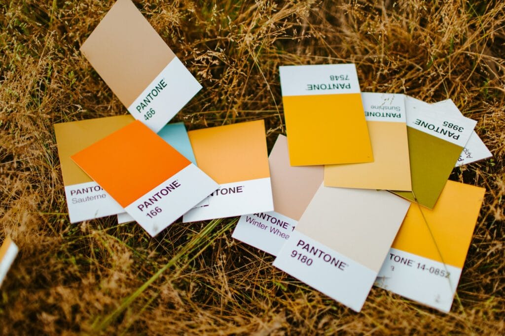
Colors are often associated with emotions. Warm colors, like reds, oranges, and yellows can be used to communicate energy, excitement, optimism, and enthusiasm. In contrast, cool colors such as blues, greens, and violets lend feelings of professionalism, dependability, and elegance.
Whether you’re designing PowerPoint slides, printed material, or infographics, using color theory for presentations will help you add depth and meaning. In XSplit Presenter, you can set the color of your slides and backgrounds to suit the mood and tone of your content. Why not subtly personalize your presentation? Choosing colors that align with either the brand identity of your company or of the client that you’re presenting to can really help!
You can make your material ‘pop’ by deploying complementary colors. The two colors that sit opposite each other on a color wheel, such as red and green or orange and blue. Using both complementary colors on a slide, for example, using one for the background and one for the text provides maximum contrast and achieves a high impact as a result.
It’s worth knowing that pure hues (color without any white or black pigment added) all have the same intensity and value (lightness or darkness). Sticking within that group will give a flat and unimpressive look. To avoid this and add interest, you should vary the tones, shades, and tints of the colors you use.

Keep it simple
One key rule in the use of color theory for presentations is to keep colors simple and balanced. Choose a palette of no more than three colors (black and white don’t count as colors for this purpose). Create a simple but eye-catching color scheme by choosing two tones, shades, or tints of one color. Then selecting a third accent color which is at least three spaces away on the color wheel.
Another rule for balancing the proportions of colors in presentation and design is called the 60-30-10 rule. According to this rule, once you have chosen your three colors, you should use the primary color for 60% of the space on the slides. The secondary color for 30% of the space, and the accent color for 10% of the space.
Use a consistent palette throughout your entire presentation, so that the same colors appear on every slide. This builds a color association with your audience and helps them to remember your presentation or brand. Using your company color palette serves much the same purpose. What’s more, consistent color-coding on headers and data can also make it easier for you to organize your presentation.
Use color to build structure
You can also use color theory to give a clear structure to your presentations. For example, using shapes or negative space can help control the flow of visual information by highlighting the different sections of a slide.
We’ve all been subjected to presentations that consist of just a few text-crammed slides. Instead, build interest and keep the attention of your audience by spreading your content out into smaller chunks of information. You can then spread this out over more slides. Then, vary the arrangement of the colors you use to make each piece of content stand out.
You can also impose structure by using the same colors for headings and subheadings on every slide. This can help your audience to find the information they need at a glance.
By playing around with colors, you can draw your audience’s attention in the direction that you want. Ensure that your presentation flows naturally, and make your presentation, and possibly your brand, more memorable to your audience! This is something we have discussed on this blog in more detail talking about how better online presentations can help you stand out!